Alpha Build Log
INTRO/GENERAL
The main goal of this build is to create a functional menu system and hopefully create a bobber system. What happened was I created the core idea of my game into a game, but I still feel like I could add more if time was more forgiving. As I wanted to focus on setting up the foundation for stuff I would add in later.
Though without any way to record progress through a notebook or new ways to challenge the player through selecting different bobbers. The alpha build is unable to really test anything other than the core fishing mechanic. Which is fine as alpha builds tend to not have much of the game, but I could not use any of the feedback given to me from the prototype testing. But one thing I did do was simplify all the code for the fishing mechanic as now it really has little to no bugs that I could find. Works as expected and acts as it should.
Which is something that a friend of mine who looked at my prototype and my code recommended I do and it works better than before since I actually understand it.
I used a browser based art creation tool called Piskel. I chose Piskel since I am a very amateur pixel artist and I have used it in the past for other assignments. It was mainly quite helpful in the creation of a handful of quickly made sprites for everything that needed a custom one.
Stuff like the fish and the bobber itself. I feel like having the bobber be a unique sprite instead of a basic Unity one makes the choice of choosing another bobber feel more impactful as both the visuals and the mechanics of the bobber have changed resulting in a change in how the game is played.
The main problem that I ran into was that I just could not figure out the bobber selecting mechanic in time for the due date. Mainly since I wanted to focus on the core elements of the game, that being the fishing mechanic working nearly perfect to what I want it to do. Which took a lot of time to reuse the old code from the prototype into a much cleaner and streamlined version.
Though for the beta build of the game I won’t have to worry about any sort of major recreation of any sort of code as I intend to focus on adding the bobber selecting mechanic and having it work within my current system or find work-arounds that don’t require major changes.
——————————————————————————————————————————————————————————————————————————
UI DISCUSSION

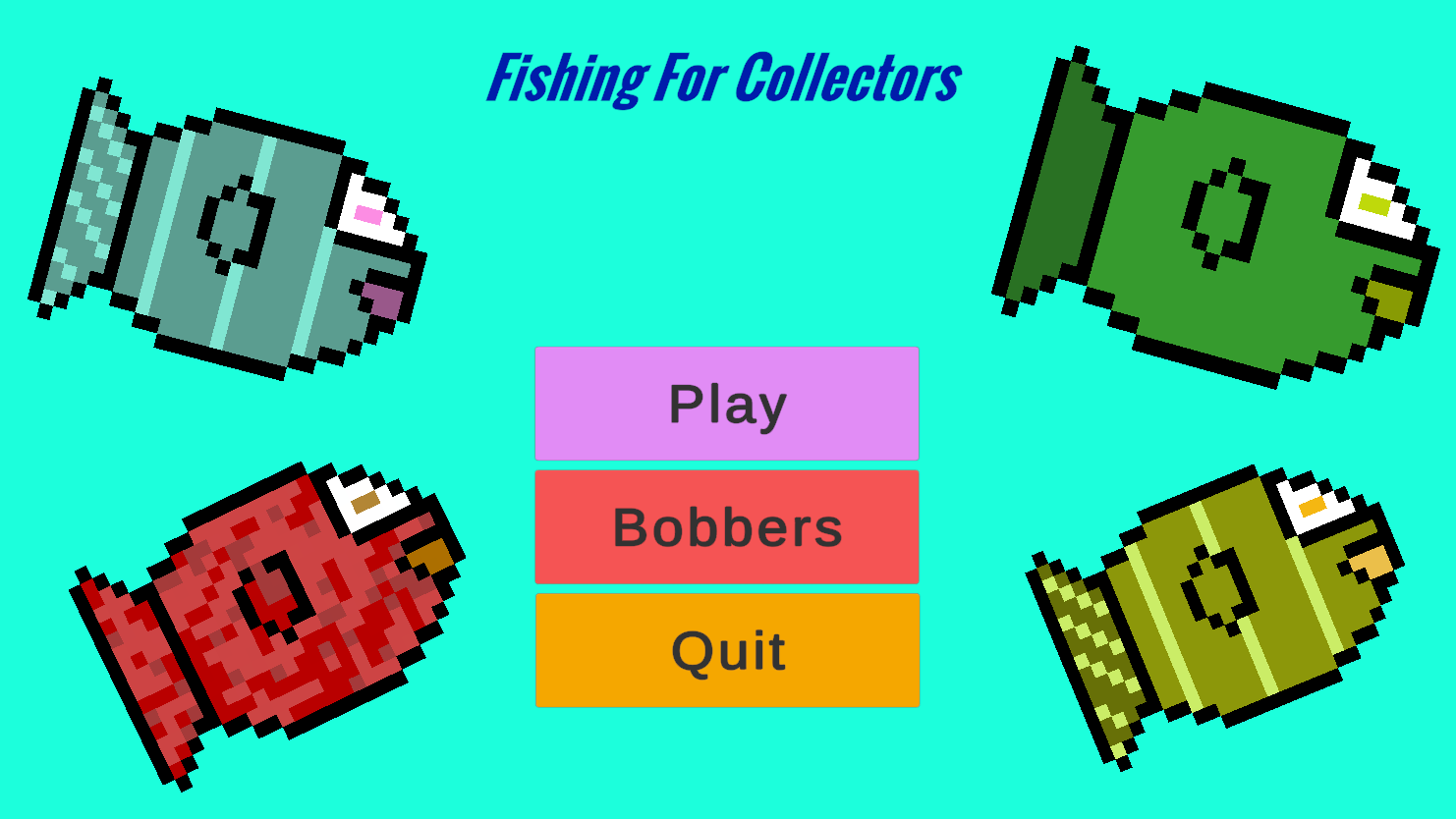
My goal for the main menu was to have it act both as the start menu and the semi pause menu. As the player has the choice to leave the fishing mechanic at any point by pressing “esc”. The choice of coloring was to make the game feel a little joyful and fun. As soft and bright colors would make players feel interested in seeing what I have to offer with my game. With the fish in the corners to give players an idea for the art style and see what they could capture.
For the fail state I felt like something simple would be best and I coded it so that it enables and disables a canvas game object, which allows me to change whatever the fail screen can be later. But for the current moment it is a simple text box that states the fish got away and with a key to let the players know that they have to restart to try again. With it taking the player back to the main menu so that they could maybe change their bobber for a different challenge or quit and call it a day. The choice of black background with red text was done to make the player focus in on the text and see that they did something wrong as in the game red = bad. So seeing red text means they did something bad.
For the win state I wanted players to see the reverse of the failed state along with the fish they caught. In the game the image is randomly chosen from a small array of sprites. The text is simple with a focus on stating that the player has a fish. And how to restart and play the minigame again. With the esc key taking the player back to the main menu to change the bobber for a better challenge or quit because they have had their fun. The text being blue is due to wanting to make the player see they did something right and they got a fish. As I feel like green should be used in a different type of pop-up. Maybe for when the player unlocks a new bobber.
The main fishing mechanic Ui is very simple and color focused. Red = bad and green = good. The basic bobber is orange to help it stand out against the colors and the slider is a simple bar that changes from red to green when it starts to fill up.
——————————————————————————————————————————————————————————————————————————
GAMEPLAY DISCUSSION
In the current build I wanted to create something more forgiving for players than a small orb that they could easily miss and have to wait till they reach it again. So in the current build there are three ovals that are large enough for quick players to gain three grip score and for players with a slower reaction time to gain grip score. I did this so that players don’t have to wait to gain more grip score and so that they prepare to hit the next green area in case they missed the previous one.
Files
Get Fishing For Collectors
Fishing For Collectors
Player collects different types of fish.
More posts
- PostmortemNov 11, 2024
- Final BuildNov 06, 2024
- Beta Build LogOct 22, 2024
- Creation of the ProtypeSep 25, 2024

Leave a comment
Log in with itch.io to leave a comment.